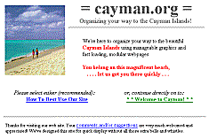
Also, here is a full-size picture
(600x400 pixel, 25K gif) if you'd like a closer look.
Please notice that this is only a picture and that the
links will *not* work
when you go to look at this picture.
While we are proud of our front page,
that's not the reason we put a picture of it here.
It does seems a bit silly to put a picture
here of something that you can look at simply by clicking on a
link like this.
Unfortunately, not everyone sees the same thing,
because each and every browser can be somewhat different.
That's why we've put this picture here: to enable you to compare your
browser's display of this particular page to our optimal one (above).
You might not see the red
accent text, but your other colors and the basic "layout"
should look fairly similar. Every page on this site
is designed using "tables" to be a standard width,
equivalent to just slightly less than the
standard full width of a 640x480 pixel VGA display screen.
Changing the size of your browser window to a width smaller than this
will not compress or reformat the text and graphics, but will merely
truncate them. This is a conscious design decision on our part
which we hope will not inconvenience too many of our visitors.
Every page should have a pure white background with
black text in normal (this) size
and reduced (smaller) size.
Some newer browsers may also see some
red text where we've used it for emphasis.
All new (unvisited) links should be in
blue
and underlined. Links that you have already visited should be in
green
and underlined.
Display Problems and Trouble Shooting:
- Text-only browser does not display graphics or tables
- =cayman.org= is currently designed only
for GUI-type graphical browsers such as Netscape and Explorer.
We regret that we cannot provide users of non-GUI browsers such as Lynx
an alternate path or set of text-only pages at this time.
We remain open to alternative methods to accomplish this and
will always welcome any related input sent to
webmaster@cayman.org.
- Tables not working, page layout jumbled or goes vertical
- Older browsers such as AOL pre-3.0 and Spry Mosaic (Internet
in a Box, Compuserve,etc) do not properly display pages that use the <table>
element to "format" text and graphics for your display.
Upgrading your browser to a more recent version,
or perhaps changing to a different browser entirely, will most likely solve
this problem as almost all current graphical browsers now fully support tables.
It should always be remembered that HTML is, in fact,
*not* a page-layout language and that the ultimate
control of how any single page appears on your screen is totally up to
your choice of browser and the way that you choose to configure it.
Despite any attempted HTML standardization effort to the contrary,
the rendering of any page onto your screen is always subject finally to the
whims of the browser designer.
- Background, text, or link colors do not match
- Most browsers allow you to customize your color and background displays
and even override those settings which normally might be passed along
as a part of the page.
If your displayed colors do not match those specified above,
check your options
settings and be sure that your override default
settings are not turned on.
Note that it will probably not hurt anything to use alternate color or
background schemes in viewing this site, but display results may be
unpredictable, though probably quite colorful.
We have chosen the "old standard colors"
for our links. We believe in standards, especially in non-verbal
communications. Just think what it would be like if the traffic light color
schemes changed from town to town!
- Java doesn't work; Frames don't display at all
- That's because we don't use Java or frames, nor do we use
any of those cutsey, flashing, twirling, twinkling, eye-catching, fascinating
techno-fluff.
We're not here to impress you with flash.
We've tried hard to not fall in love with the technology.
Instead, we are spending all of our time and attention on
content-enhancement.


